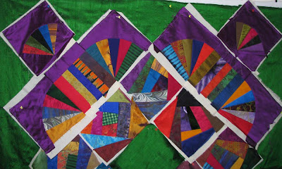
I have put these strips in between the fans. Is it ok? I am totally second guessing myself with this. Do you do this too. I may take the green center out and put a regular block in there. I am not sure yet.
I am most worried about the fans. I don't know what else to do there. I am tired of re-doing blocks with this quilt. Can you tell I am getting frustrated? Let me know what you think about the fans and strips in between.


 Quilter Blogs & Store Search

8 comments:
Kerri, Your drawing of this is very impressive. I think the fans are great, but the green is screaming at me and I think it detracts from the other colors. I just can't get past it to visualise the rest.
I'll be the first to say, however, that you're the only one who has the vision of where you're going and embellishments always seem to put the fabrics in their place.
Bruce is a nice guy, but you are't making this quilt for him.
Why don't you start embroidering some of the CQ blocks? While you are doing that, you can let ideas for the rest of the quilt simmer. You don't have to decide right now about the green.
Start stitching!
Marci
He thinks that is *dark*?!??!!? Whoa. I think it's beautiful!
I like the way the fans are set now with the strips. I'm okay with the green around the outside, but the blank green square in the center is... odd. IIRC, you were going to do a large embroidery on it, right? That should tone it down and make it one with the pieced blocks.
Kerri,
Have you thought about flipping the strip blocks so that they run horizontal because the way they are set it looks like they are a continuation of the fan blocks. The green doesn't bother me at all!! Have always just loved your work over the years. Need to not overthink this too much. It will be fabulous.
Love ya, Gwen
Glad so see you back!!!
I love your fabrics. The green looks great with the purple. Have you tried it with solid purple squares to break up the fans...or solid green? The strips like fine as they are, but do look like a continuation of the fans, so the fans likely won't stand out with this arrangement unless you have a trick up your sleeve with the embellishments.
I like the center green square. It gives a place to rest the eye, and I think that will continue to be true even after you embellish it with a floral spray (I think that's what you mentioned doing). The colors are beautiful. I wouldn't change anything.
The colors are fine - it's not too dark. As for the center block - I'd applique a purple square in the middle of the solid green. It would tie things together. Keep going - it's fine
Kerri, I LOVE what you are doing here! The green is perfect. Don't give up!
I agree with Pam, a purple square in the center is a great idea...I might make it the same hue, but a slightly darker value. Also, you could possible ease the transition between the fan blocks and the green surround by having a seam treatment at that edge that is both a brilliant color AND green...so the difference isn't as stark between the two areas.
What you have here is just fantastic...and is only the first layer. You can tweak it and shape it however you want with the stitching and embellishment.
DON'T GIVE UP HAVE FAITH ALL WILL BE WELL! ;-)
Post a Comment